From a market perspective, 2017 was the calm before the storm. Then, February’s tempest blew in a turbulent first quarter, with a significant spike in volatility. But if we look through the lens of history, we get a clearer picture of “normal” volatility, and see the wisdom of a diversified and rebalanced portfolio.
Perspective is the gift that time gives us. Especially when we look at market volatility. Let’s examine the atypically calm year 2017 and how it might have led to unrealistic expectations for the first quarter that followed:
- Realized volatility was unusually low, in the 2%-4% range
- Historic volatility has been higher 99% of the time
- Realized twelve month volatility has been between 8% and 18% over 69% of the time, with 12%-14% most typical
Implied volatility needn’t suggest fear
Traditionally, investors and traders look at the options market to assess near term volatility as implied by options prices (the VIX Index.) This index is often referred to as the “investor fear gauge.” Since 2012, options markets have exhibited lower implied volatility, suggesting relatively calm and perhaps complacent market expectations. While spikes in the VIX Index typically accompany market selloffs, higher VIX doesn’t necessarily imply prolonged weakness. Indeed, equity markets frequently move higher despite higher VIX.
History confirms volatility. Particularly in the short term.
Asset classes like equities are prone to occasional sharp market declines. One should expect bouts of volatility, especially over short periods.
Smaller corrections are more likely over shorter periods
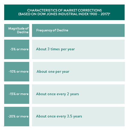
The chart below shows the likelihood of corrections in 5% increments over time. Historically there is a 96% probability of 5% or more corrections within any given year, averaging about 3 times per year.


